


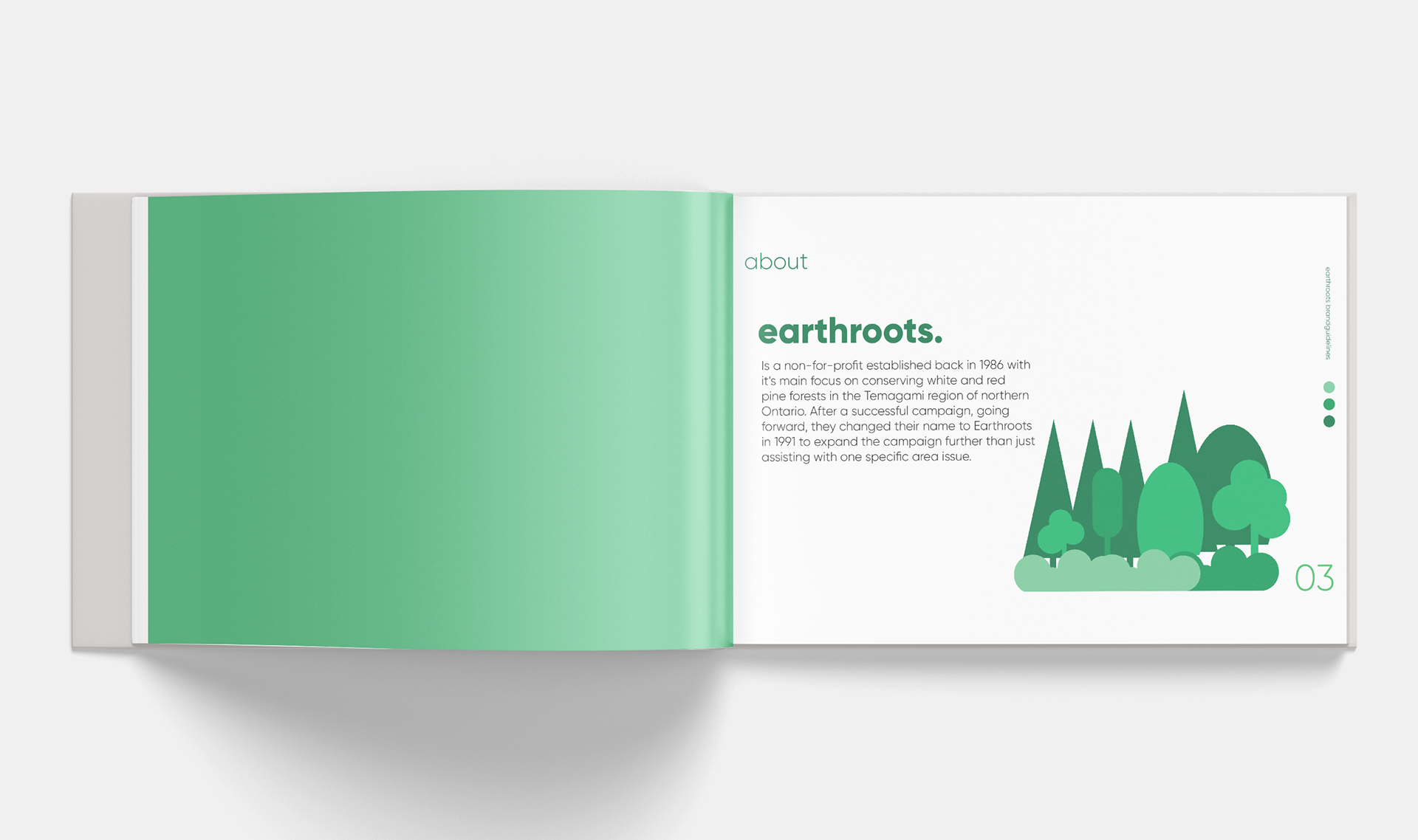
Earthroots was a rebrand group project for a non-for profit organization out of Toronto, ON. Earthroots is a non for profit that brings in less than $500,000 yearly. They aim to improve Ontario’s wildlife and ecosystems. They currently a few campaigns running. One to save the wildlife (wolves, caribou, cormorants), Temagami and ancient red and white pine ecosystems, and parks and green spaces. They aim to promote awareness and help the ecosystems in Ontario before it is too late.

The choice of colour palette was aimed to directly correlate with what Earthroots really stands for and as a reflection of what Earthroots focuses on. The different hues of blue and green contrast well in the primary palette, but the illustration palette brings depth and contrast. Using a palette beyond really brings in a balance and a playful aspect to the entire brand.